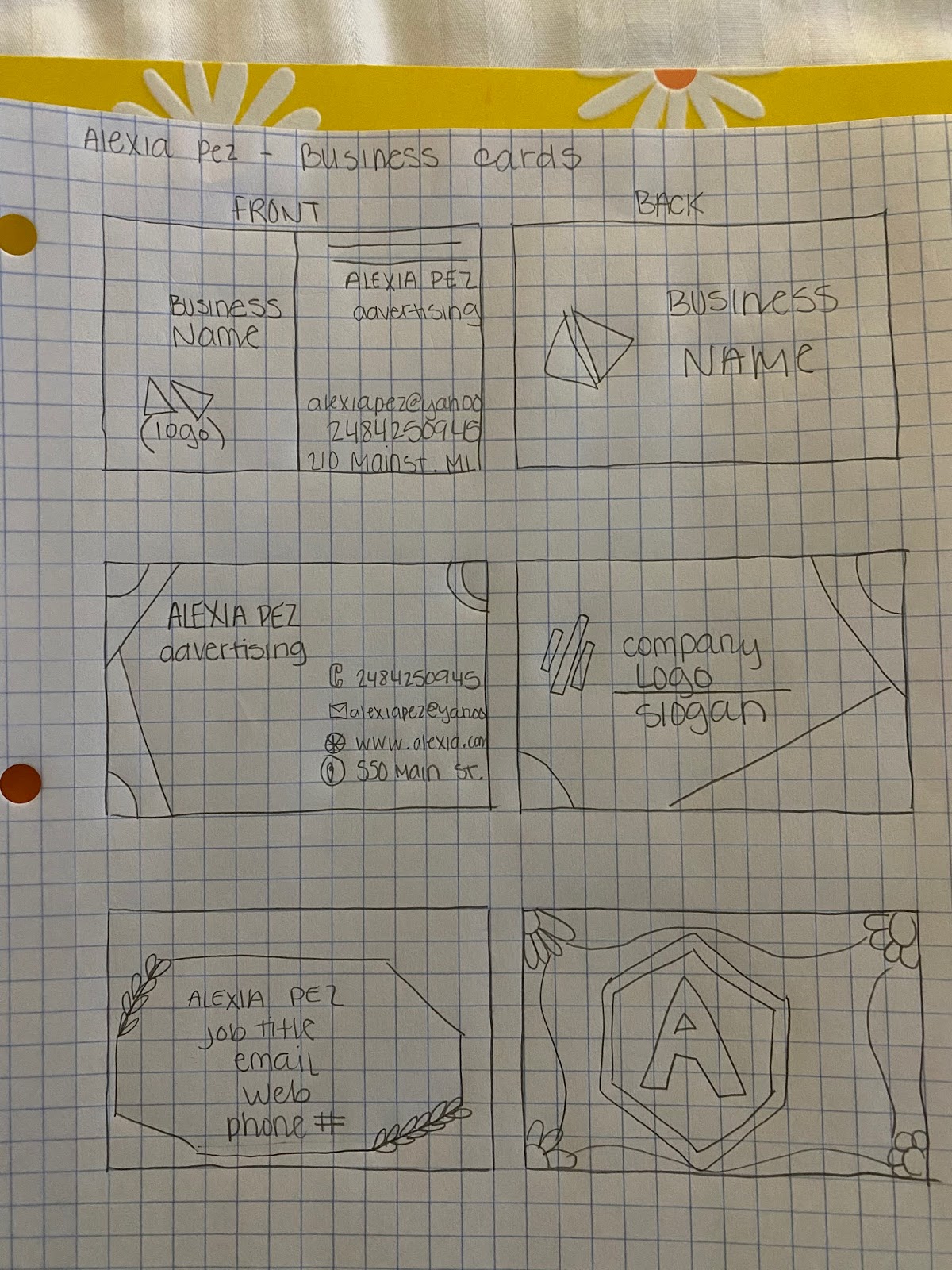
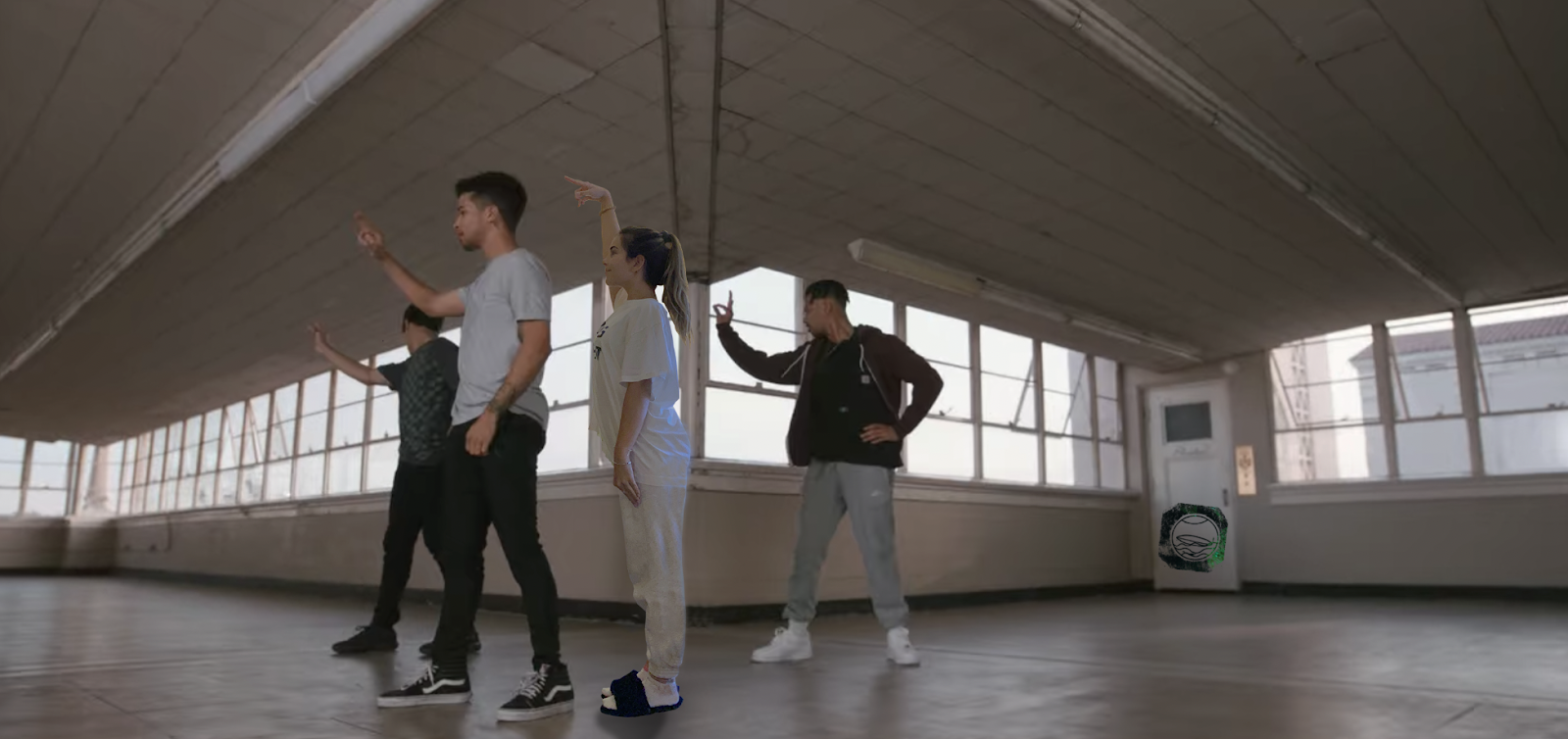
Posts

Final Portfolio

Image
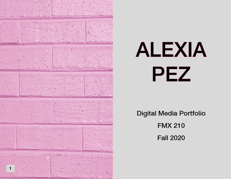
My Final Portfolio   Here is every page from my final portfolio. I chose pink bricks as my theme and used it on every page, so it looked neat. I did not want to write on top of the pink bricks with small letters, so I used gray backgrounds for what I typed so it is easier to read. I cannot believe I have accomplished it! I am so proud and happy because I have learned so many techniques during this class. Although it has been stressful at times, Professor Roundtree tried her hardest so we all understood what was happening. I wish the pandemic was not a thing so that we could be entirely in person for this class, but that is okay. I cannot wait to use my new skills for the rest of my life and in future jobs. This class was definitely not what I expected it to be, but I am happy that it surprised me. 

Business Cards

Image
My Sketches: My Final Business Cards: For this assignment, I had to create three business cards using InDesign. I did not really follow what I drew out for my sketches since I used flowers for one of them. I decided flowers would be unprofessional since I do not own a flower shop. My first final design is pretty simple, using pink and orange from my logo to make cornered lines. For my second card, I added a blue wave at the bottom. I like the back side of that one because it is split in half. Lastly, my last card has small yellow circles going down each side, and the back has four colored corners with the middle logo. The last one is my favorite because I love the colors I used and how the logo stands out. It was very entertaining to complete this project because it gave me visions for my future. It is going to be so exciting to have a real personal business card someday!  

Business Card Sketches

Image
  These up here are my three sketches for possible business cards. It took me a little bit because I wanted to think of cool designs and not be boring. I like them because they are all different types of styles. The top one is more formal because it has less design, and it gets straight to the point. The second one has some lines and circles to add some design. Finally, the last one has some flowers which I think makes it look charming. Even though flowers can be a little overwhelming for professional things, I believe a couple of them or tiny ones would look fine. I am excited to see how they turn out in the application!  Updated card:

Somewhere

Image
Final Project: Image used of myself: Screenshot from a movie: For this project, I had to photoshop myself into the scene of a movie. I chose the movie Work It; it is about this girl who needs to get better at dancing to fulfill her dreams of being professional. This group of boys helped her with the process, so I thought it would be perfect to add myself and make it seem like I am dancing with them. I took a self-timer picture of myself, reenacting the same dance move they were doing. I think it worked out well, considering there was an open space between two of the boys. This space seemed a little awkward, so I filled it with myself. This project was enjoyable and challenging. I would say the hardest part was finding the right movie scene and picture of myself. It was just a little bit time consuming to place myself in there after that was done, but it was very doable. I am proud of myself for being able to do this!    

Ps H2

Image
1) I think this picture would be hard to photoshop myself into because Kendall is pulling his cheeks. I feel like I would have a hard time editing the cheek to make it stretch. It would definitely be simple to just keep the normal face shape.  2) This image gave me inspiration for my Somewhere project. I think it is really funny how he photoshopped his face into the Lion King scene. This is a type of idea I would love to try and accomplish.  3) This image was really funny to me because she wanted the plastic item removed and he ended up removing her boobs! I feel like this was simply a complete fail, very funny though.  4) This image would be really funny to recreate. I love how the lady is so serious and professional, but behind the scenes, it is so uncomfortable. This simply shows the lengths people will go to to get a good image.       

Autoscopy

Image
 My final product: My original image: Images I used: For this autoscopy project, I decided to create something that means a lot to me. My mother took this image of me driving one day, and I decided to use it to add the ocean in the window area. My goal was to make it seem as if I'm driving in the sea, and the sparkles at the top show how I am going somewhere nice and exciting. There is a light guiding me to my destination. The planet at the top of my head resembles how I always think about the universe and how interesting it is. I recently discovered that I am very into this topic, and I want to learn more about it. Finally, I added a rainbow at the bottom of my image to show that there can be different answers to your problems; that is why there are different colors in a rainbow. This means that people can see things differently, so only focus on what is best for you and take yourself there. This project was enjoyable to do, and I am excited to be learning so much about photoshop.

BW to Color

Image
 Original Selfie: Monochromatic: Triad: Analogous: This project assignment was exciting and different. This is not what I expected to do in Photoshop, but it was really cool. It took me a while to understand how to complete this assignment because there were many videos and different steps. It took me a lot of patience and concentration, but after I was done with the first colored one, the other two were not that bad at all. I think I did a good job, and I am happy with my results. I chose my colors from the analogous, triad, and monochromatic. I did not even know these things existed, but I am happy that now I know! I am excited to see my classmate's projects and see what everyone chose to do. My favorite is the monochromatic one because the colors really compliment each other, and it looks the most natural. The other ones are a little bit too intense for me, but still, look really nice.